This design in this series of posters begins with a simple shape that is repeated, connected and cut to create a uniquely shaped background. From this stage, different layers blend together to create a unique composition. Messages are injected as typography creating new perspective and dimension.
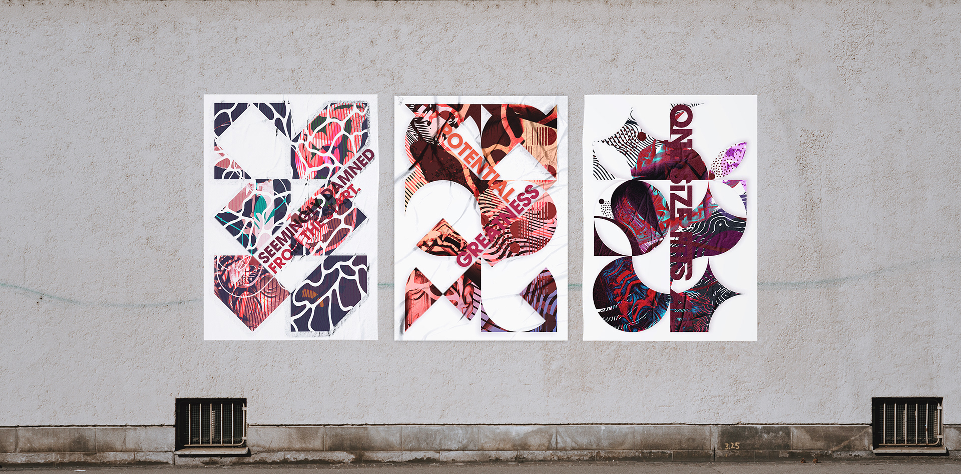
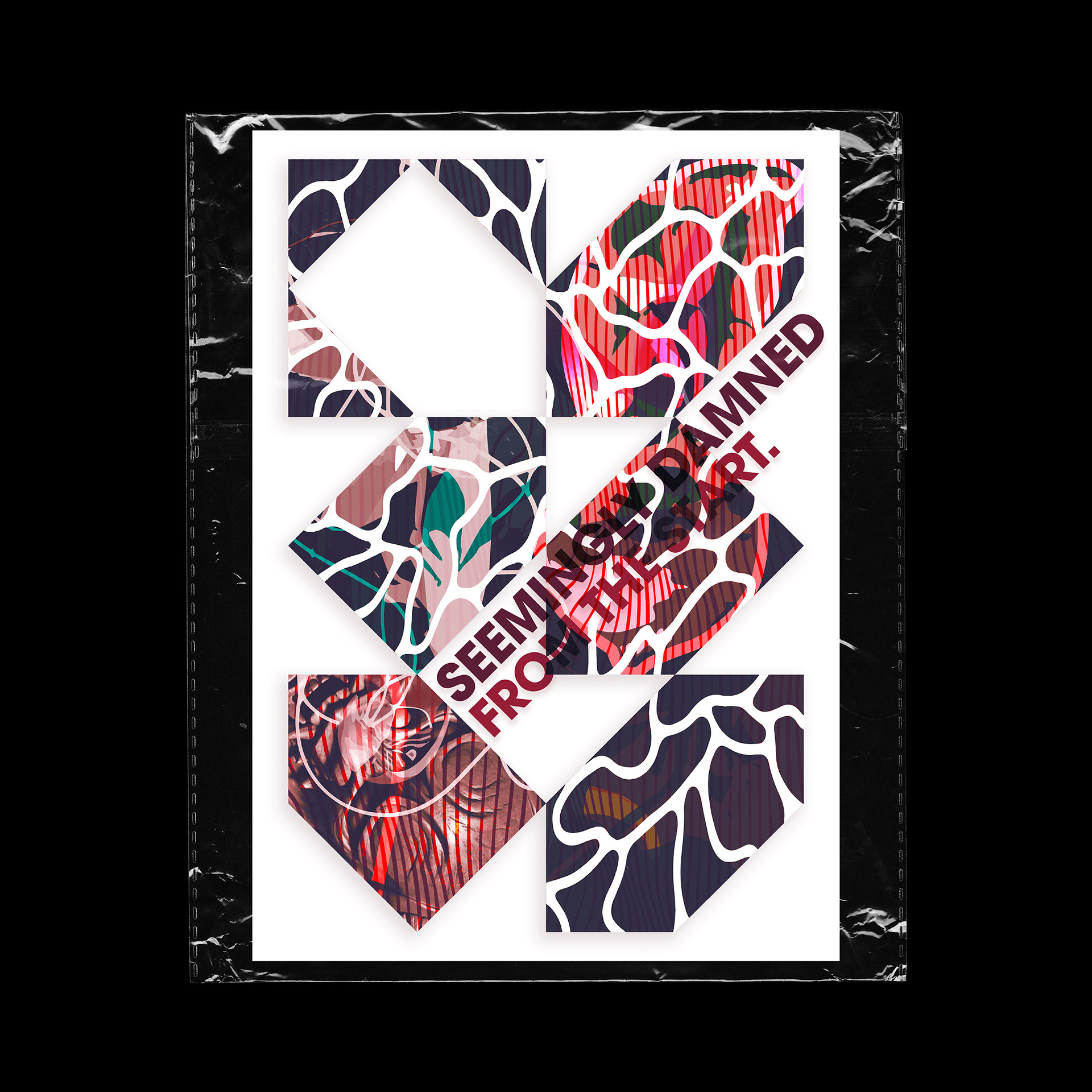
Poster 1 : Seemingly Damned from the Start
The message behind the this line revolves around the idea of how an individual, idea, or concept begins on the wrong footing. Whether that may be the wrong intentions, a lack of tools to complete a task or the wrong place at the wrong time. The race lost, before the runner step foot on the track.
The visual aspect of this poster finds contrast where molten liquid like shapes juxtaposes a study statue and angular shapes. The composition is fixed within an angular grid with a secondary mask of the flowing shapes. Typography is implemented following this grid and blending into the random design elements.
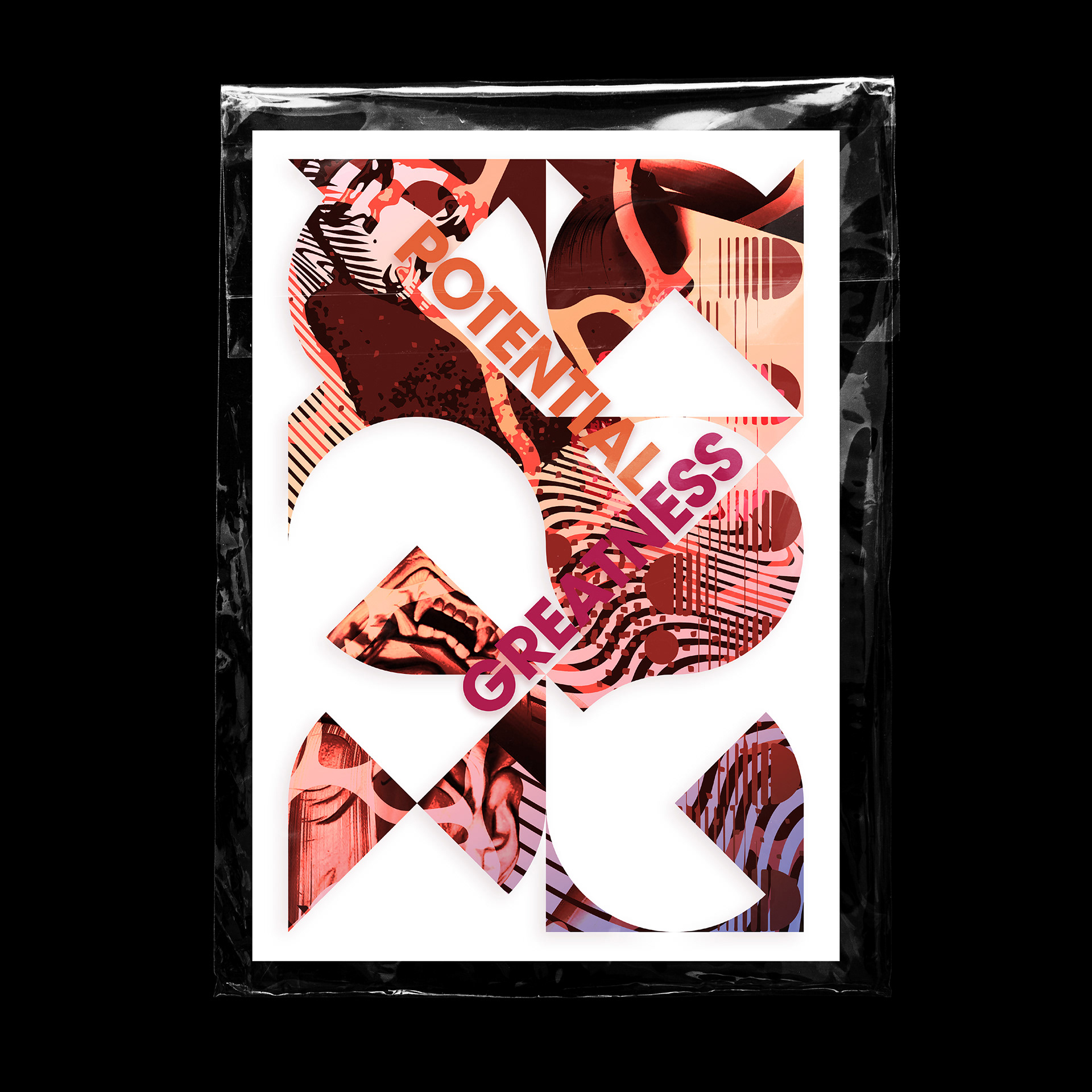
Poster 2 : Potential For Greatness
The two word in this poster is missing the word that joins them "For", I ultimately didn't include this in my poster because I thought the two words together would be adequate for interpretation. This composition is fixed within a grid that is made up of elements deriving from a circle and a square, the end result is both flowing and angular. Various texture and shape blend to spark intermittent passages of coherence within the design's overall random makeup. Cohesion also exists from the established grid system.
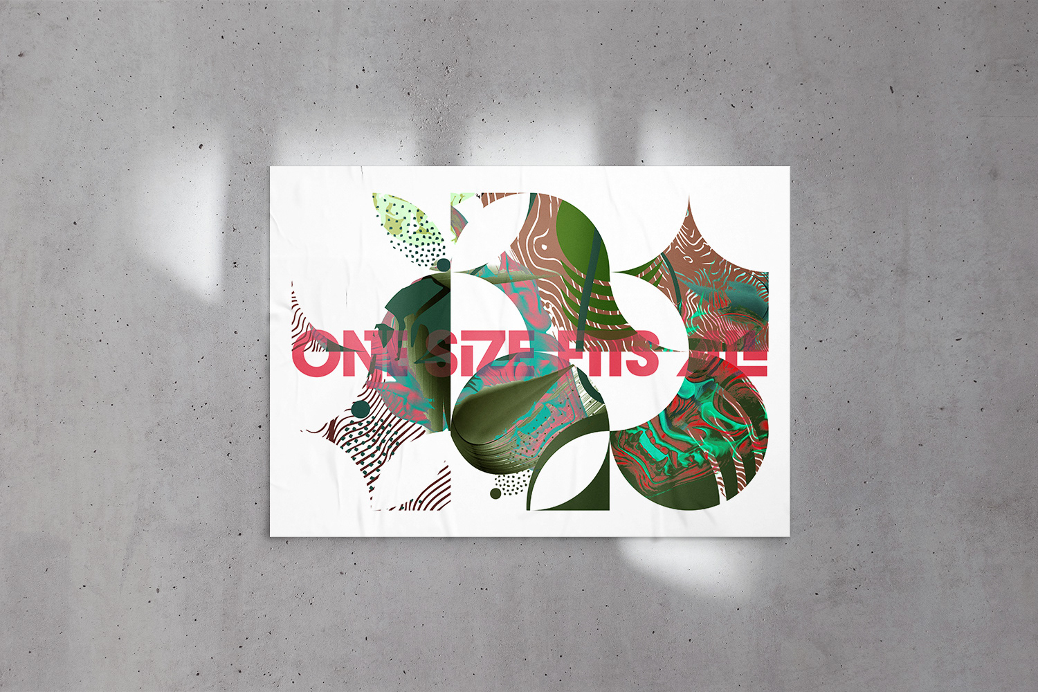
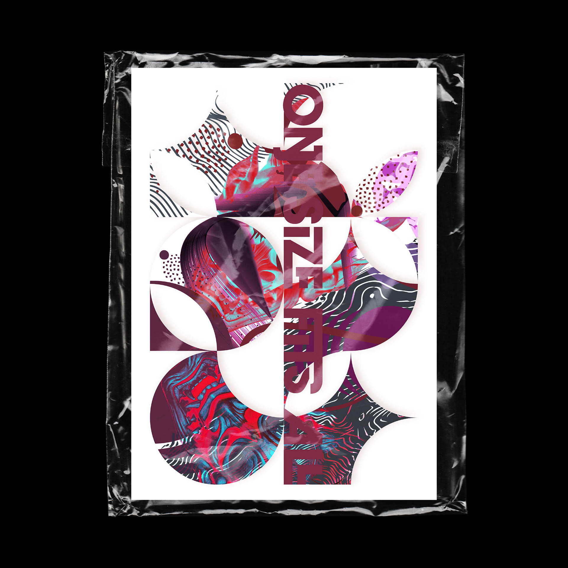
Poster 3 : One Size Fits All
This message is part of an originally longer statement I wrote,
"A metaphor I find to be fitting to the newspaper, was they would take a one-size-fits-all approach to making decisions... ...It’s quite idiosyncratic that through their attempt at appealing to the most people possible, they lacked the personality that people actually wanted."
What I thought was an interesting statement that related to the specific subject, it later sparked a chain of thought in my mind about where the philosophy of "One size fits all" exists in my life and where it doesn't. As how H&M is targeted at the largest target market possible whereas a more niece brand perfects it's aim at a niece culture / target market.
That aside, the composition fits inside a system of circular and crescent form, negative space in this grid framework creates petal and triangular shapes. Considering the result of elements that exist within this framework, I'm reminded of cookie cutter shapes and trimmings. Contrasting media blends to create aggressive character in the poster an abstract effect I'm drawn towards.
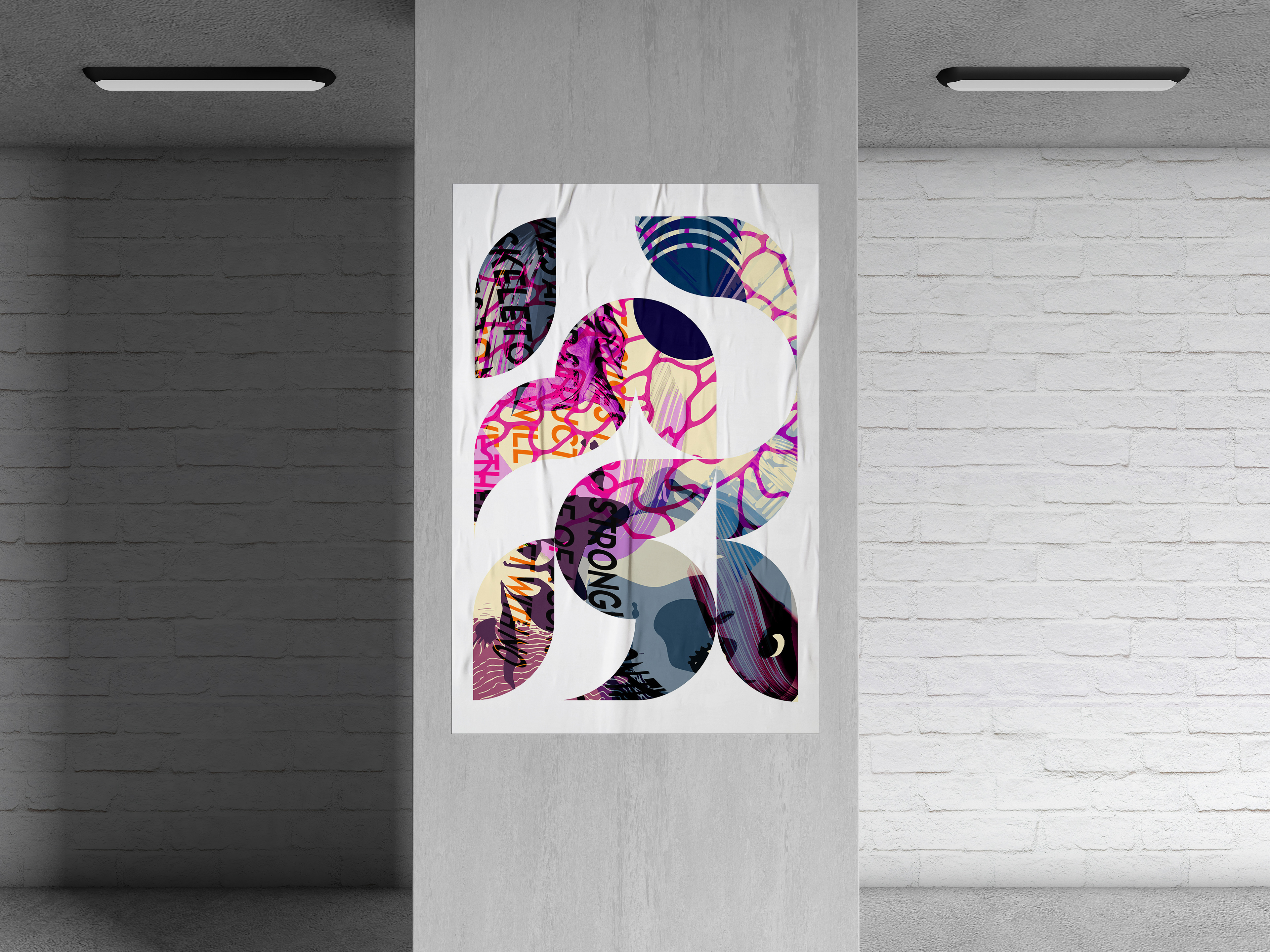
Poster 4 : Under Water
This contents of this poster live within a very modular framework that doesn't vary is strongly in thickness. leaves a breathable negative space with a clear sense of direction and what might consider order. The typographic element is only revealed with the presence of texture, pattern and shape. The randomness that established the placement of elements lead to an eye peaking through the bottom-right shape. This eye allows for a perception that the overall design is a window into another universe or dimension. A microcosm. This might spark curiosity about what life if like on the other side of the pane.
The mood of this poster is mostly gentle but a bit more chaotic in the upper left. The typographic element hides from the viewer. This way of placing the type gave me the perception of being underwater and how it restricts my senses. Another observation regards how the shapes flow into one another, When trying to interpret this form, the shape of a snake reveals itself, this is is exaggerated when I consider the bottom right form to mimic a snakes head.