Introduction
AIST’s in-house newsroom, SuperTalk, discusses the big issues in superannuation, giving insights from industry experts and updates from the Advocacy team. The website needed a visual identity refresh and a redesign of its user interface and user experience to better meet the needs of its users. In this project, I took on the challenge of updating the website to make it more user-friendly and visually appealing.
Problem Statement
The original SuperTalk website was outdated and lacked a clear visual identity. The user interface was cluttered, making it difficult for users to find the information they needed. These issues resulted in a poor user experience, with visitors quickly leaving the site in search of a more accessible news source.
Design Process
To begin, I conducted extensive research on newsroom websites, gathering insights into the best practices and user behaviors. I then created a variety of design concepts and tested them with real users to determine which would best meet their needs. Based on that feedback, I created a final design that incorporated a refreshed visual identity, a clean and modern user interface, and a user-centered experience.
Visual Identity Refresh
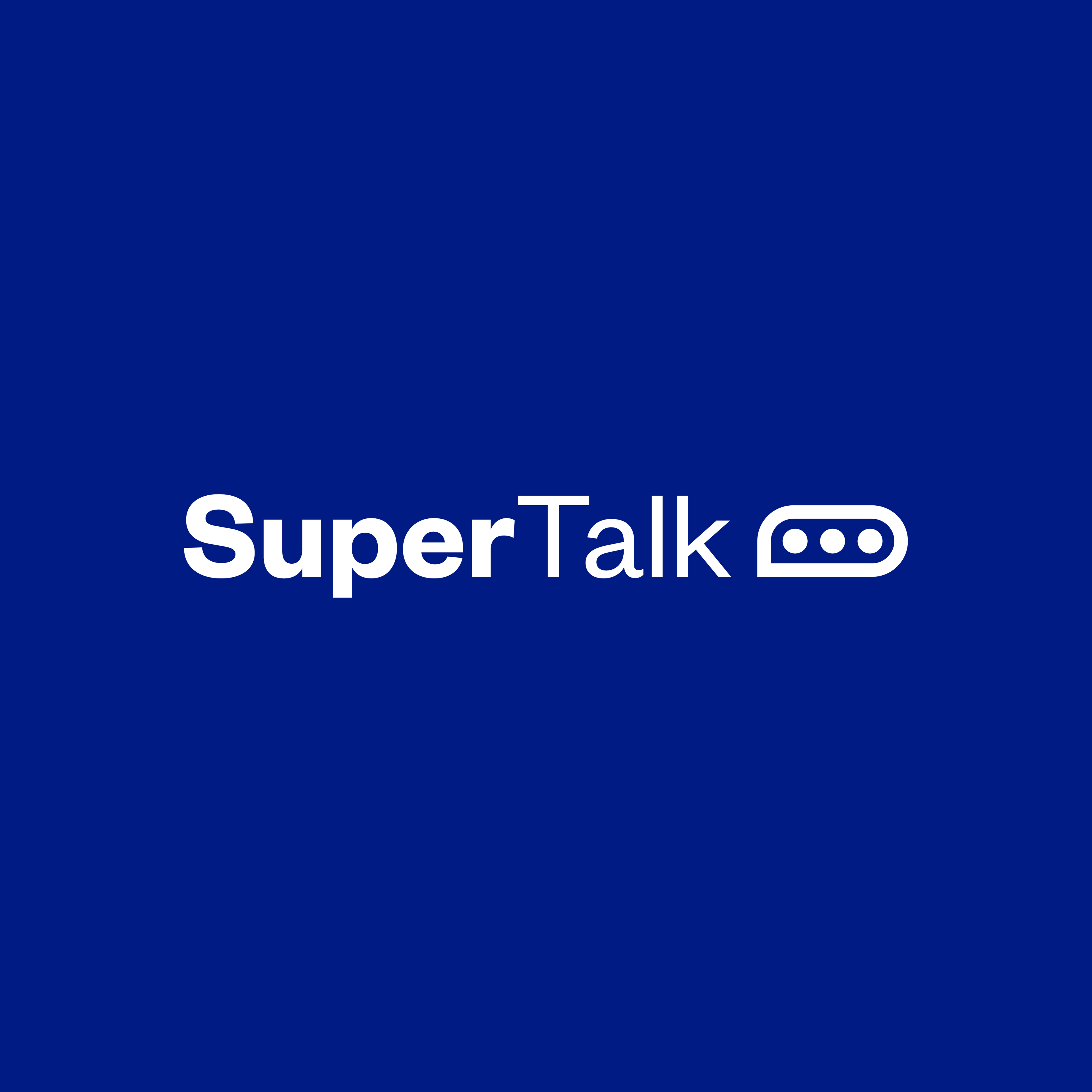
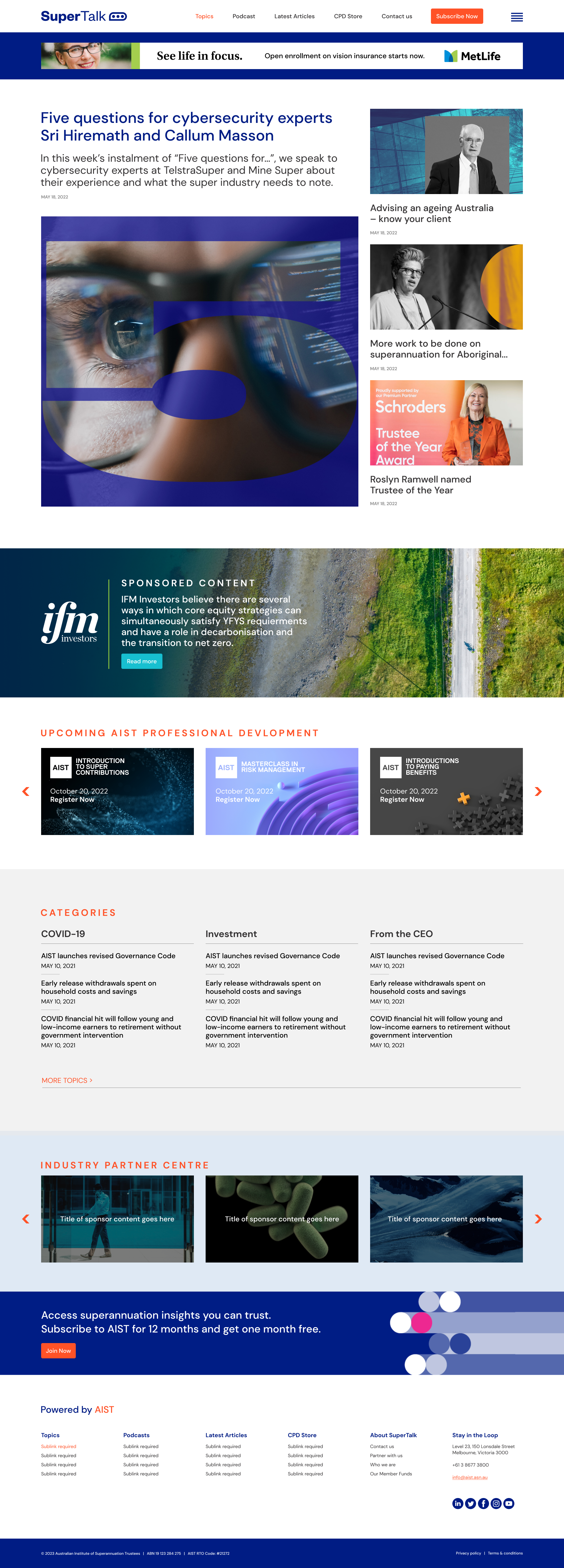
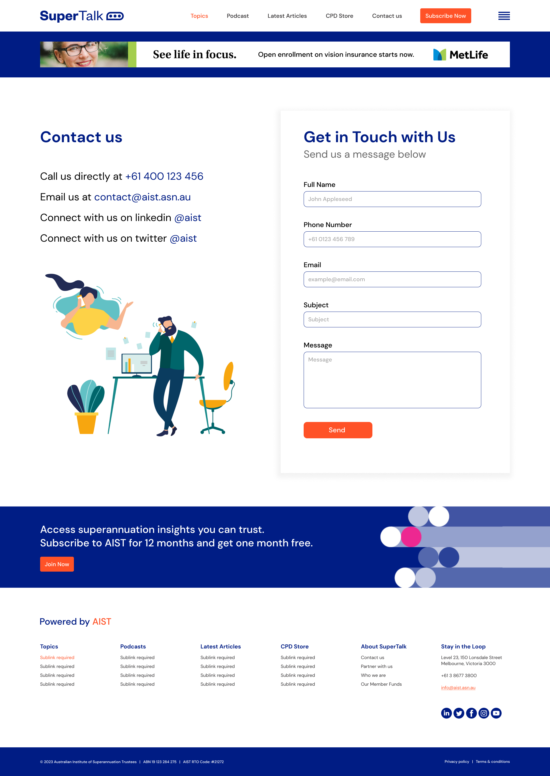
The new visual identity for SuperTalk includes a modern logo and updated color palette. The logo is clean and simple, making it easy to recognize and remember. The color palette includes vibrant and inviting hues, which help create a welcoming environment for users. These updates give SuperTalk a fresh and contemporary look that better represents the brand.





UI/UX Redesign
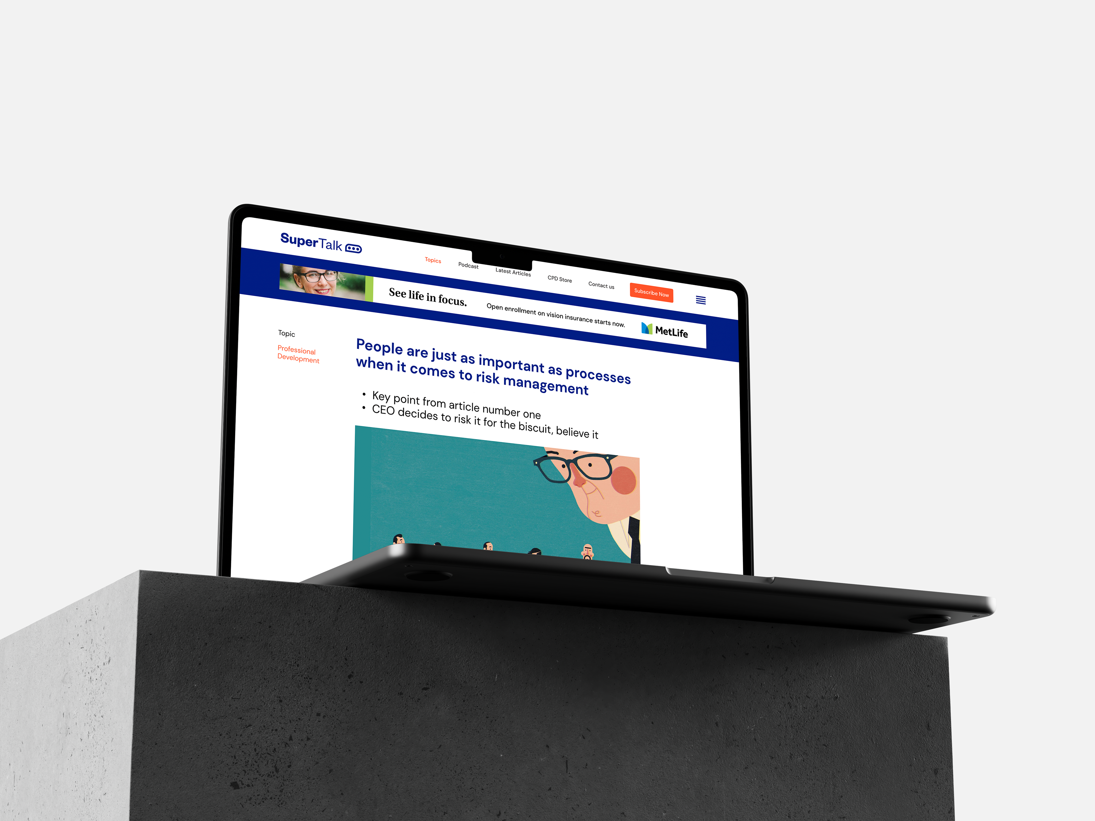
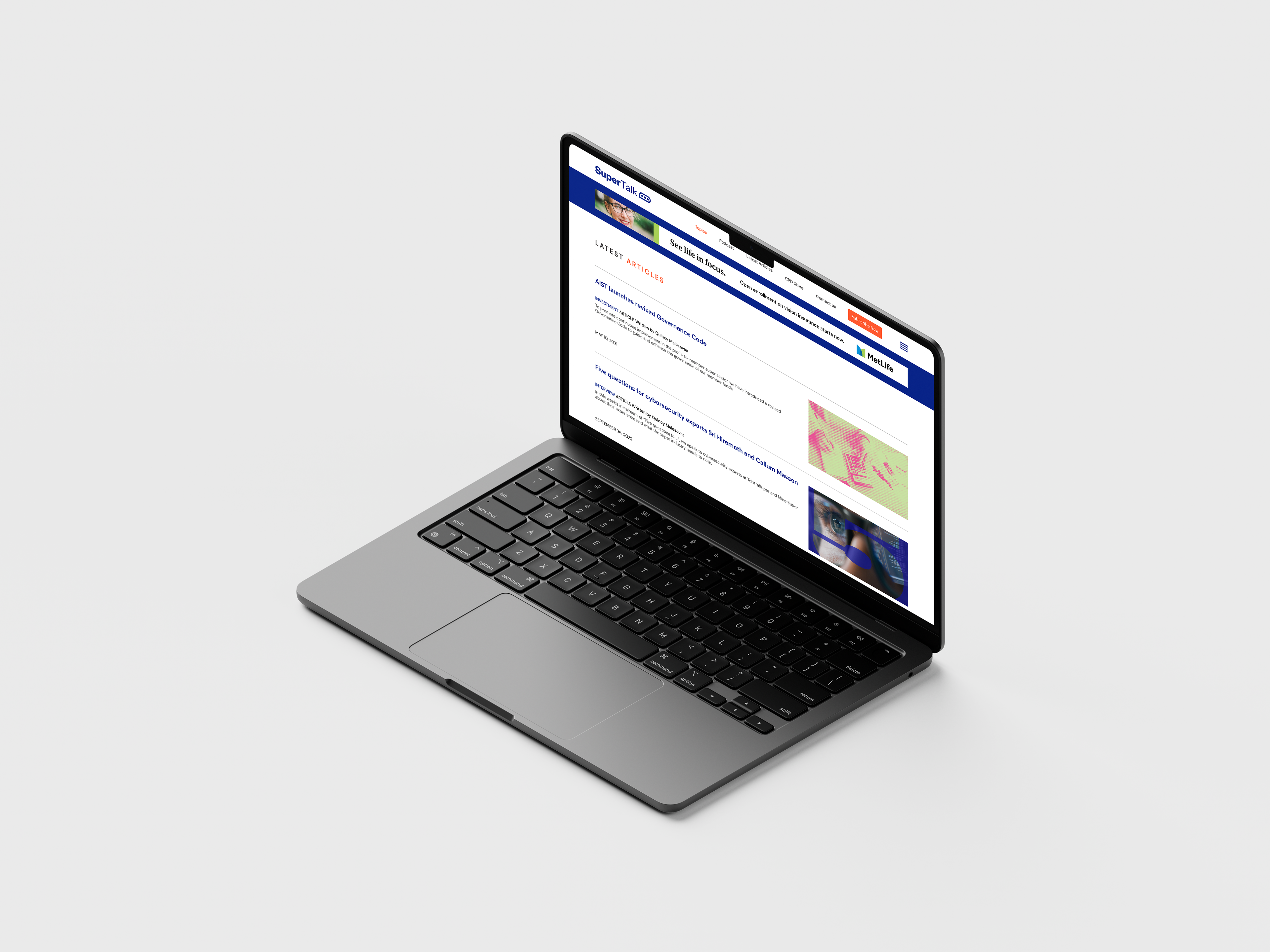
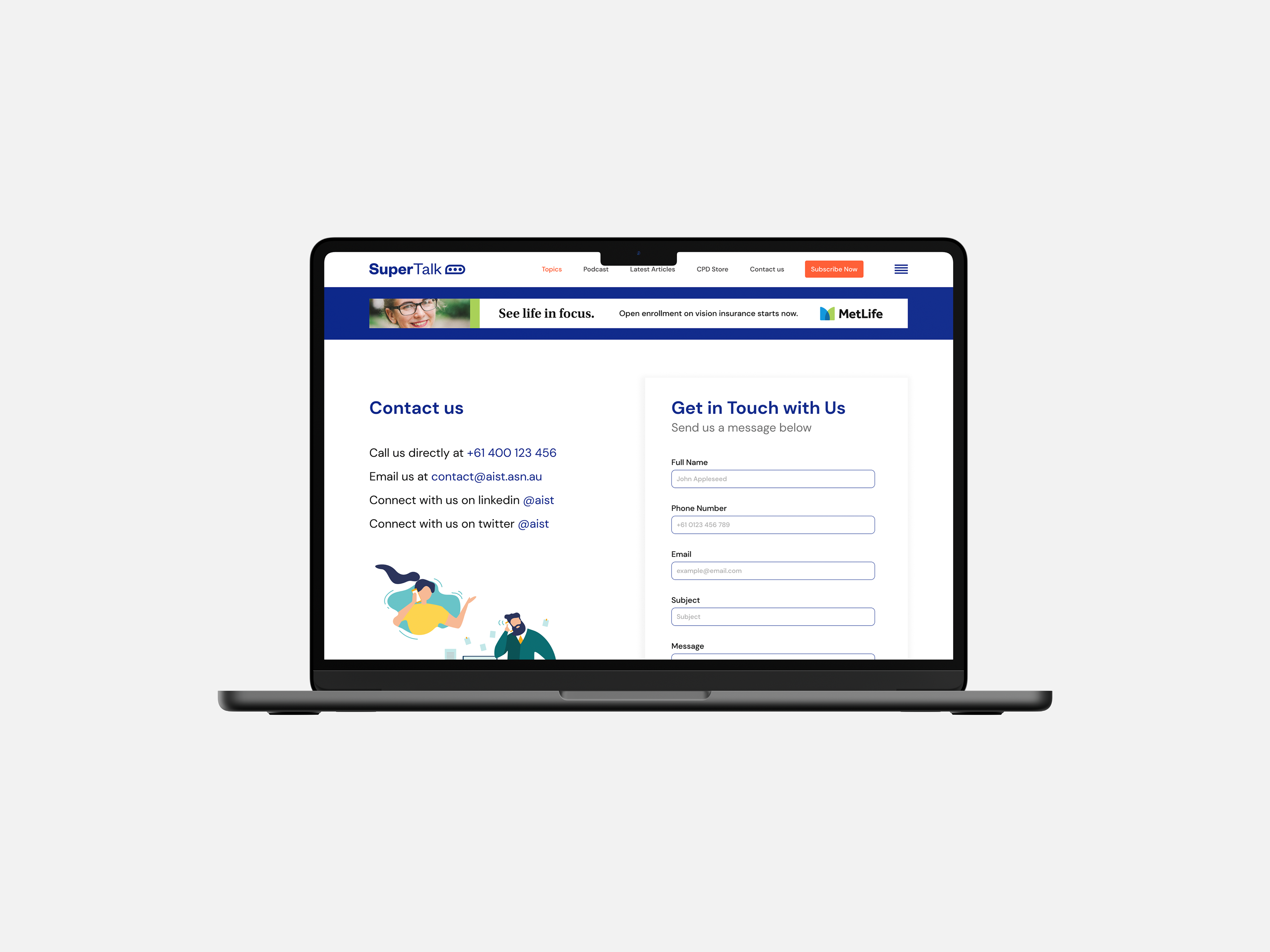
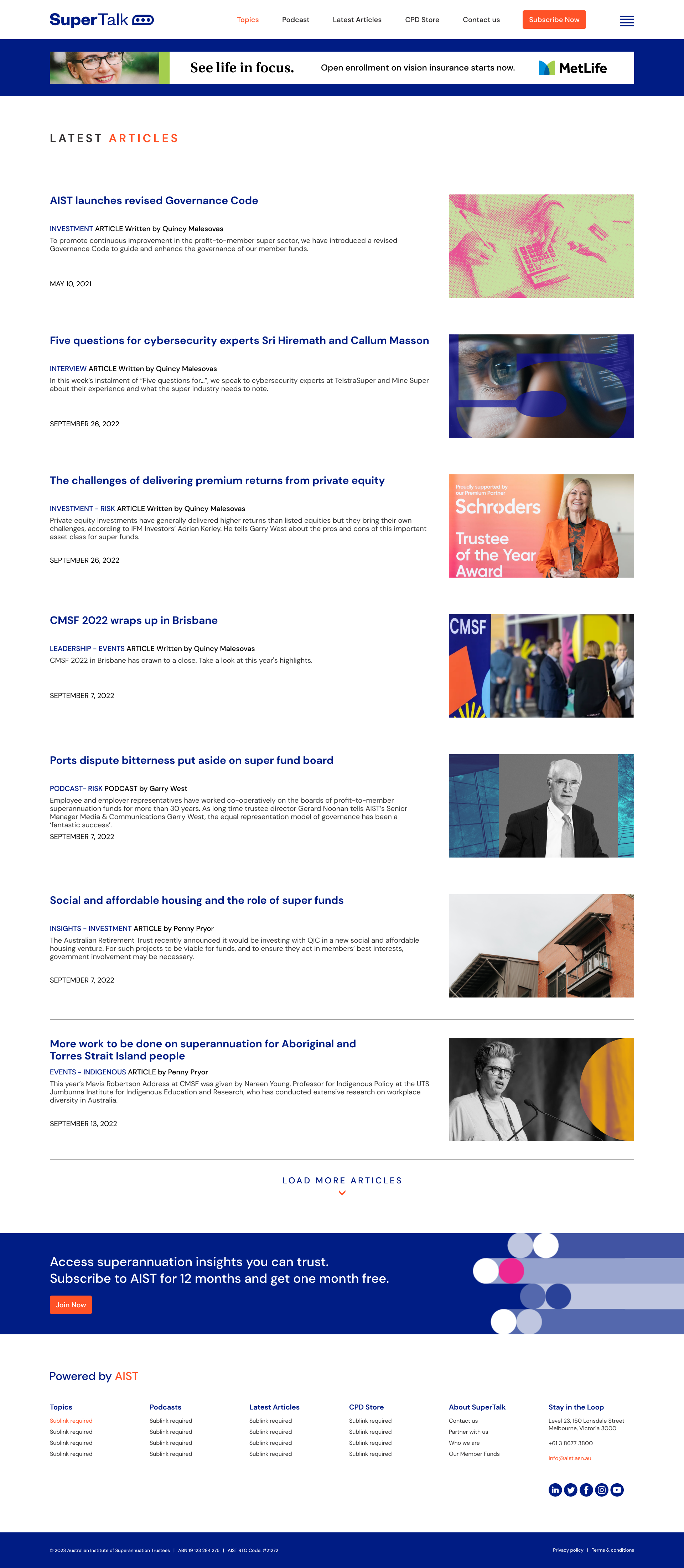
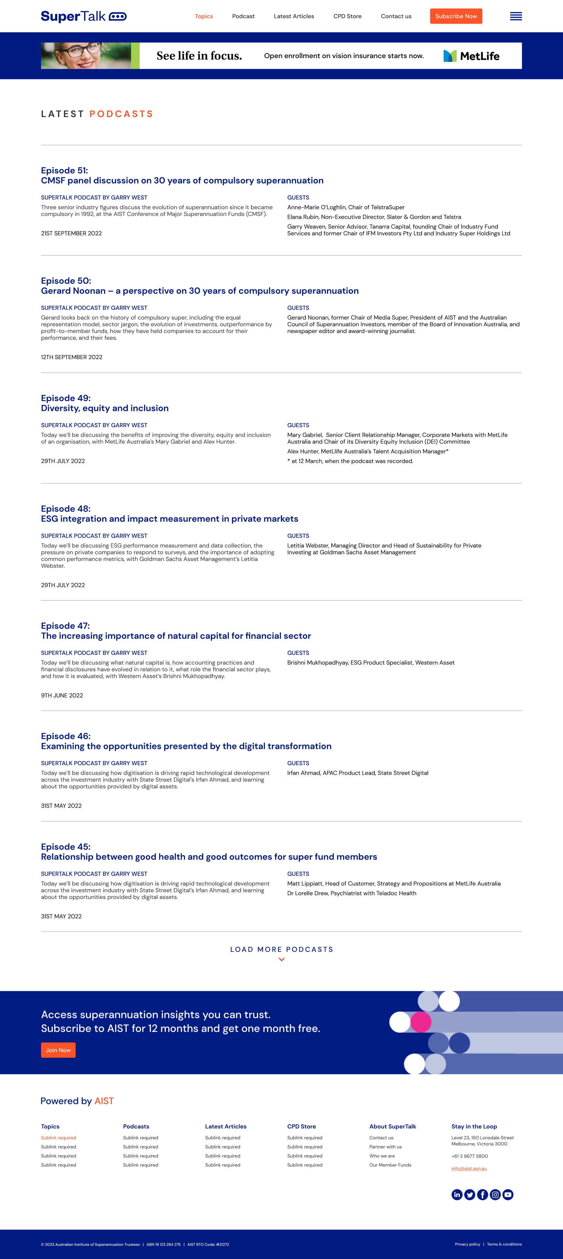
The user interface of SuperTalk has been completely redesigned to provide a cleaner, more organized layout. The new design is easy to navigate and helps users quickly find the information they need. The user experience has also been improved, with a focus on creating a seamless and efficient flow for users. This includes intuitive navigation, clear calls to action, and a responsive design that adapts to different devices.


Results
The new SuperTalk website has received positive feedback from test groups, who appreciate the refreshed visual identity and the improved user experience. We expect to see an increase in engagement and time spent on site, demonstrating that the design changes will have made a positive impact. The new visual identity and user-centered design has resulted in a more user-friendly and visually appealing website that better meets the needs of its users.
Conclusion
The SuperTalk newsroom website was in need of a refresh and reflecting on the ambitions we established for this project, the AIST marketing team and I feel that we reached this goal successfully.
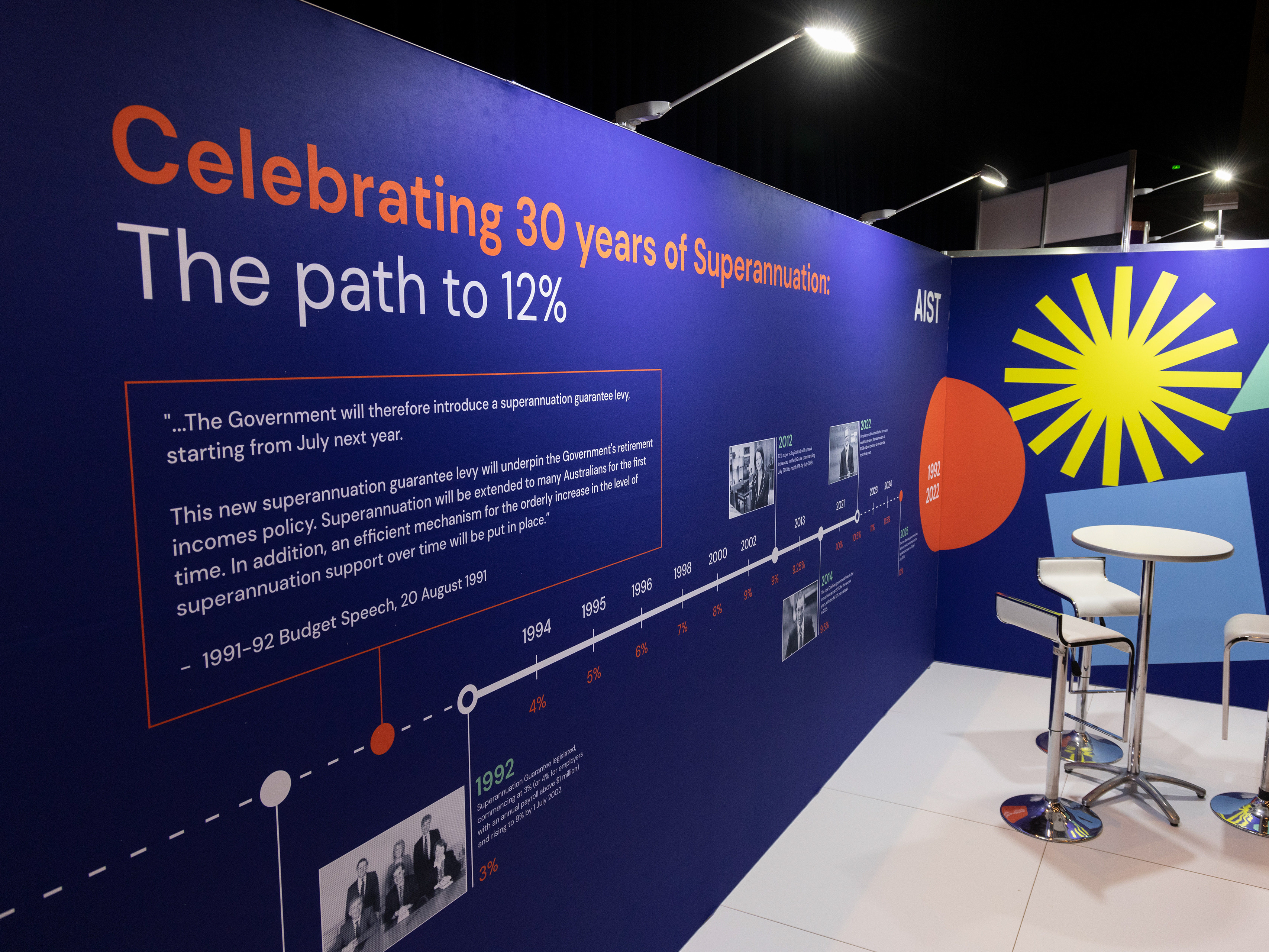
In addition to this project serving as a great opportunity to utilize and refine both my visual identity and UI/UX design skills, I gained valuable experience collaborating within an integrated marketing team. This team consisted of the senior graphic designer, the head of marketing, the copywriter, and the front end developer. As one of the more substantial projects I worked on during my tenure at AIST, I am proud that the improvements we made will add both value and credibility to the news and content we publish.
In addition to this project serving as a great opportunity to utilize and refine both my visual identity and UI/UX design skills, I gained valuable experience collaborating within an integrated marketing team. This team consisted of the senior graphic designer, the head of marketing, the copywriter, and the front end developer. As one of the more substantial projects I worked on during my tenure at AIST, I am proud that the improvements we made will add both value and credibility to the news and content we publish.
Project Details
The project was designed using Adobe Creative Suite and Figma and is now in the final stage of implementation by the Front End Developer at AIST. My role in the project included conducting user research, creating design concepts, developing the visual identity, and designing the user interface and user experience.
